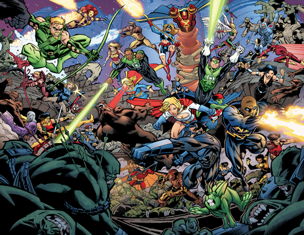
So I'm going to break down this crazy double page spread and how I tackled it.
It was drawn by Scott McDanial
http://www.scottmcdaniel.net/ and inked by Andy Owens (couldn't find a website).
1. The Black and White:
Needless to say when I first saw this I could have been overwhelmed. Lucky Scott is a really cool guy and asked me back at the penciling stage if he could do anything to help me on my end. Surprisingly I didn't ask for much except for a background issue (which i'll get to late).

2. Flat the black and white... I use flatters. I love them and they are well worth it for me. My guys and girls do a great job but I usually still need to go in a tweak it for my own break ups after all I'm the one coloring so they don't always know what my end result is going to be. Once the break ups are done I do something called "re-flatting." This is where I assign the flat colors I'm going to start with.
I have to have a few goals when I do this:
1. asign the correct colors to each character/building/sky/etc... The Characters are VERY improtant. The Background is usally down with regarde to the overall mode and plot/story goals.
2. I will sometime fill a mood color at this point to either the entire scene or parts. I do this to either help break-up parts of the scene or effect a mood. Now this image was so large I decided to render it as a whole and then use color to effect depth after wards (see #3). ....but that being said I did do a fill of about 20% blue over the whole image before I started to render to push it towards a more night oriented scene.
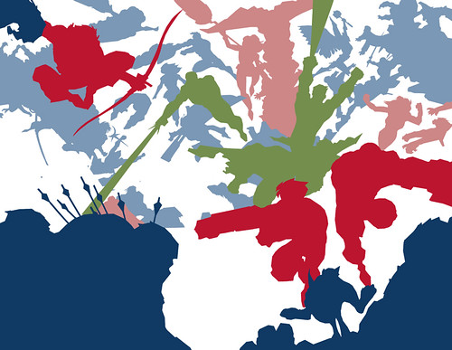
here's the flats right before I rendered:
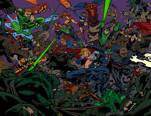
3. ok Render... errr wait, I mean if I just render away without thinking about it first the image is going to look flat. So I did that and thought about how I could break this up into levels. I went so far to make each level it's own selection area.
each color represents a different depth.
4. NOW render...
now I didn't save the rendered version before I implemented the depth because I don't work that way. I pushed and pulled as I worked to make thing recede or move forward. I did this in a non destructive way to the renders by using lots of layers using different color modes but usually "COLOR" or "NORMAL."

The thing that Scott did for me was to make the casttle it's own piece of art so that I could plug it in on my own. This made it way easier to implement in the end.
so there you go... questions?